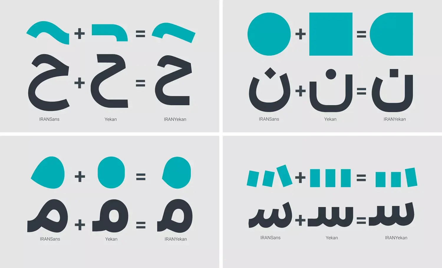
Fonts and typography are among the most important tools for giving identity to graphic design. Choosing the right font can give a brand or project personality and convey a specific feeling to the audience. In contrast, a poor combination of typefaces can create clutter, inconsistency, and undermine the credibility of a design.
The first point when selecting a font is aligning it with the nature of the project. Every font has its own story—some are formal and serious, others are modern and clean, and some feel friendly and casual. It’s essential to pick a typeface that matches the message and tone of the project. For example, using a decorative, playful font in a formal business report is rarely a good choice.
Next, legibility and clarity are critical. Even the most beautiful fonts lose value if they are hard to read in small sizes or on digital screens. Always test your chosen font at different scales to ensure users can read the text comfortably.
When combining multiple fonts, it’s best to create controlled contrast. This means your selected fonts should be different enough to establish visual hierarchy, but not so different that they disrupt overall harmony. Often, pairing a display font for headings with a clean, readable font for body text works well.
Smart use of white space and font size also plays a key role in effective typography. Appropriate spacing between lines and letters increases legibility and gives the design a sense of order and professionalism.
Ultimately, remember that typography isn’t just about picking a few pretty fonts—it’s the art of creating clear, harmonious, and inspiring communication. Thoughtful selection and combination of typefaces ensure your message reaches your audience more precisely and powerfully.